
Packaging Insights
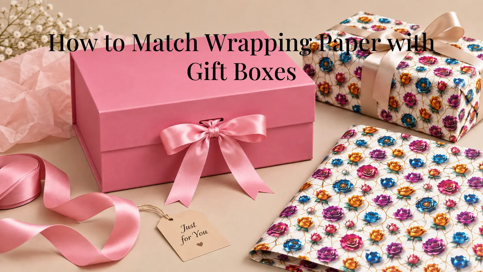
Ever wrapped a gift, stepped back to look at it, and felt like something was just… off? Usually, the problem isn’t the wrapping paper or the gift box on its own. It’s the way the two work together.
Matching wrapping paper with gift boxes doesn’t require complicated design rules. A few simple decisions about color, pattern, texture, and finishing details can make a noticeable difference to the overall presentation. Even a straightforward box can look more coordinated when the wrapping paper complements rather than competes with it.
The key is knowing which element should attract attention and which should support it. A patterned box may work best with simpler wrapping paper, while a plain box gives you more freedom to use a printed or colorful design.
This guide explains how to match wrapping paper with gift boxes without making the process unnecessarily complicated. Whether you’re preparing a single gift, putting together several gifts for an event, or selecting packaging for a retail or gifting business, these practical principles can help you create combinations that look coordinated rather than cluttered.
The Short Version, If You’re in a Hurry
If you don’t want to overthink your gift packaging, start with these simple rules:
- Choose one main visual element — either the box or the wrapping paper.
- Keep the overall color palette to two or three colors.
- Pair a patterned box with simpler paper, or patterned paper with a simpler box.
- Consider the occasion before choosing colors and patterns.
- Use ribbon, tissue paper, or a gift tag to connect the different elements.
- Match the scale of the pattern to the size of the gift box.
- When in doubt, a solid-color box with printed wrapping paper is one of the easiest combinations to coordinate.
You don’t need everything to match exactly. In fact, perfectly matching every element can sometimes make the presentation look flat or overly uniform.
The goal is coordination, not duplication. Think of the box, wrapping paper, ribbon, tissue paper, and tag as parts of the same overall presentation rather than separate elements that all need to look identical.
Why Matching Actually Matters
It’s easy to think of wrapping paper and gift boxes as two completely separate decisions.
You choose a box because it is the right size and structure. Then you choose wrapping paper because you like the design. But once they’re placed together, the eye sees them as one package.
That’s why gift presentation depends on more than the individual pieces. A well-designed box can look too busy when paired with equally bold wrapping paper. Similarly, a plain box can give patterned paper the space it needs to stand out.
Good coordination doesn’t mean that everything has to be the same color, pattern, or finish. Instead, the different elements should have some relationship with one another. That relationship can come from:
- A shared color
- A complementary color
- Similar or contrasting textures
- One dominant pattern
- A simple ribbon or tag that connects the elements
Another useful consideration is visual balance. If several parts of the package demand attention at the same time, the final presentation can feel cluttered. When one element leads and the others support it, the package is generally easier to look at and feels more organized.
This becomes especially important when packaging is being prepared for multiple gifts, events, or retail presentation. A consistent approach to colors and patterns can make several packages feel connected without requiring every package to look exactly the same.
Once you start looking at packaging this way, choosing combinations becomes much easier. This balance is one reason gift boxes can play an important role in product and gift presentation, rather than simply serving as a container.
Start With One Question: What’s Leading the Look?
Before choosing your wrapping paper, decide which element should have the strongest visual presence.
Is the gift box already decorative? Or is the wrapping paper going to provide most of the visual interest?
Trying to make both equally noticeable is where many combinations become unnecessarily busy. Instead, think of one element as the lead and the other as the supporting element.
- If the Box Is the Star — Some gift boxes already have a strong visual character.
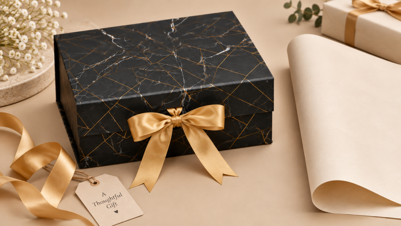
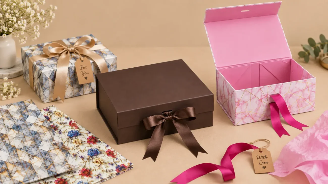
For example, a Foldable Magnetic Lid Box with a marble pattern has a noticeable surface design of its own. If you add heavily patterned wrapping paper around it, the two designs may compete.
In this situation, simpler paper is usually the better choice.
Try:
— Plain white paper
— Cream or beige paper
— A color taken from the box
— A subtle texture
— A single-color wrapping paper with a contrasting ribbon
The box remains the main feature while the wrapping paper supports it. - If the Paper Is the Star — If you’re using a strongly printed wrapping paper, let it take the lead. A plain or solid-color box gives the pattern enough space to stand out without competing with another major design.
This is particularly useful when the wrapping paper has:
— Large florals
— Bold geometric patterns
— Illustrations
— Strong seasonal designs
— Multiple colors
The simpler the box, the more freedom you have with the paper. - If Both Are Fairly Plain — This is probably the easiest situation. A plain box and plain wrapping paper don’t need to be identical. In fact, choosing slightly different but related colors can make the presentation more interesting.
For example:
— Cream box + muted green paper
— White box + pale blue paper
— Black box + grey paper
— Kraft-toned box + cream paper
You can then introduce a stronger accent through the ribbon or gift tag.
Wrapping Paper Color Combinations That Actually Work
You don’t need to know color theory to create good wrapping paper color combinations. A handful of simple approaches can help you coordinate most gifting situations without spending too much time trying to find the “perfect” match.
The easiest place to start is with the color of the gift box. From there, you can either stay within the same color family, choose a complementary shade, or create a controlled contrast.
- Warm and Neutral — Neutral shades such as cream, beige, kraft, white, and soft grey are easy to combine with stronger colors.
For example:
— Kraft + burgundy
— Cream + forest green
— White + deep red
— Beige + dark blue
These combinations work particularly well when you want the packaging to feel coordinated without looking overly complicated. - Monochrome With One Accent — Choose different shades of one main color and add a single contrasting accent.
For example:
— Light pink + blush + rose
— Pale blue + navy + white
— Cream + beige + dark brown
Then introduce one accent through the ribbon or tag. This approach works particularly well for weddings, anniversaries, and other occasions where you want a controlled color palette. - Complementary Colors — Complementary colors sit opposite one another on the color wheel.
Examples include:
— Blue + orange
— Green + red
— Purple + yellow
You don’t have to use these combinations at full intensity. A muted version of one color combined with a stronger version of the other can be much easier to work with. - Analogous Colors — Analogous colors sit close to each other on the color wheel.
Examples include:
— Blue + teal + green
— Yellow + orange + red
— Pink + red + purple
These combinations naturally feel connected because the colors share visual characteristics. - High Contrast for Festive Occasions — Festive packaging can handle stronger contrasts. Some familiar combinations include:
— Red + white
— Green + gold
— Black + gold
— Red + gold
— Deep green + silver
The important thing is to avoid adding too many additional colors once you’ve selected a strong combination. - A Simple Color Rule — If your box already has a noticeable color, look for a wrapping paper that either:
— Uses a related shade,
— Complements that color, or
— Provides a controlled contrast.
Then keep the ribbon and tag within the same general palette.
A useful rule is to choose the box and wrapping paper first, then add the smaller finishing details. This prevents the ribbon, tag, and tissue paper from introducing unnecessary colors before you’ve established the main combination.
Gift Wrapping Color Combinations by Occasion
The same gift box can look completely different depending on the colors, patterns, and wrapping paper used with it. When choosing gift wrapping color combinations, start by considering the occasion before worrying about the finer details. The goal isn’t to follow strict rules for every event. Instead, think about the type of presentation that suits the occasion and then choose colors that support it.
The type of box you start with can also influence how you approach the overall presentation, especially when choosing packaging for different occasions; our guide to different types of gift boxes for every occasion covers the main box styles and where they work best.
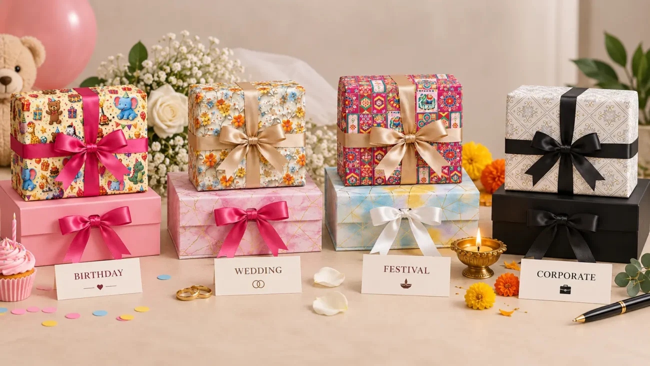
- Birthdays — Birthdays allow more flexibility. Bright colors, pastels, playful patterns, and contrasting combinations can all work depending on the recipient and type of gift.
Examples:
— Pink + white
— Blue + yellow
— Purple + pink
— Multicolor printed paper + solid box - Weddings — Wedding gifting often works well with softer combinations.
Consider:
— Ivory + sage
— Blush + white
— Dusty blue + cream
— Beige + muted green
The aim isn’t necessarily to make the packaging plain, but to keep the overall combination visually balanced. - Festivals — Festivals are a good opportunity to use stronger colors and more noticeable patterns.
Consider:
— Red + gold
— Green + gold
— Orange + cream
— Deep blue + gold
If the wrapping paper is already heavily patterned, keep the box and ribbon simpler. - Corporate or Professional Gifting — For professional gifting, neutral and controlled palettes are generally easier to coordinate.
Examples include:
— Navy + white
— Charcoal + silver
— Kraft + cream
— Black + white
— Dark green + beige
The packaging doesn’t need to be visually complicated to look well considered. - Everyday Gifting — For everyday gifts, simple combinations are usually enough. Kraft paper with a colored ribbon, a solid box with printed paper, or a neutral box with one accent color can work across many situations. If you’re preparing several gifts at once, using a consistent color family while varying the paper pattern slightly can also help the collection feel coordinated without making every package identical.
Pattern Coordination: The Rule That Saves Most Gifts
Color is only half the equation. Pattern coordination is where many otherwise good combinations can go wrong. Even colors that work well together may look disconnected when both the box and wrapping paper contain strong or competing patterns.
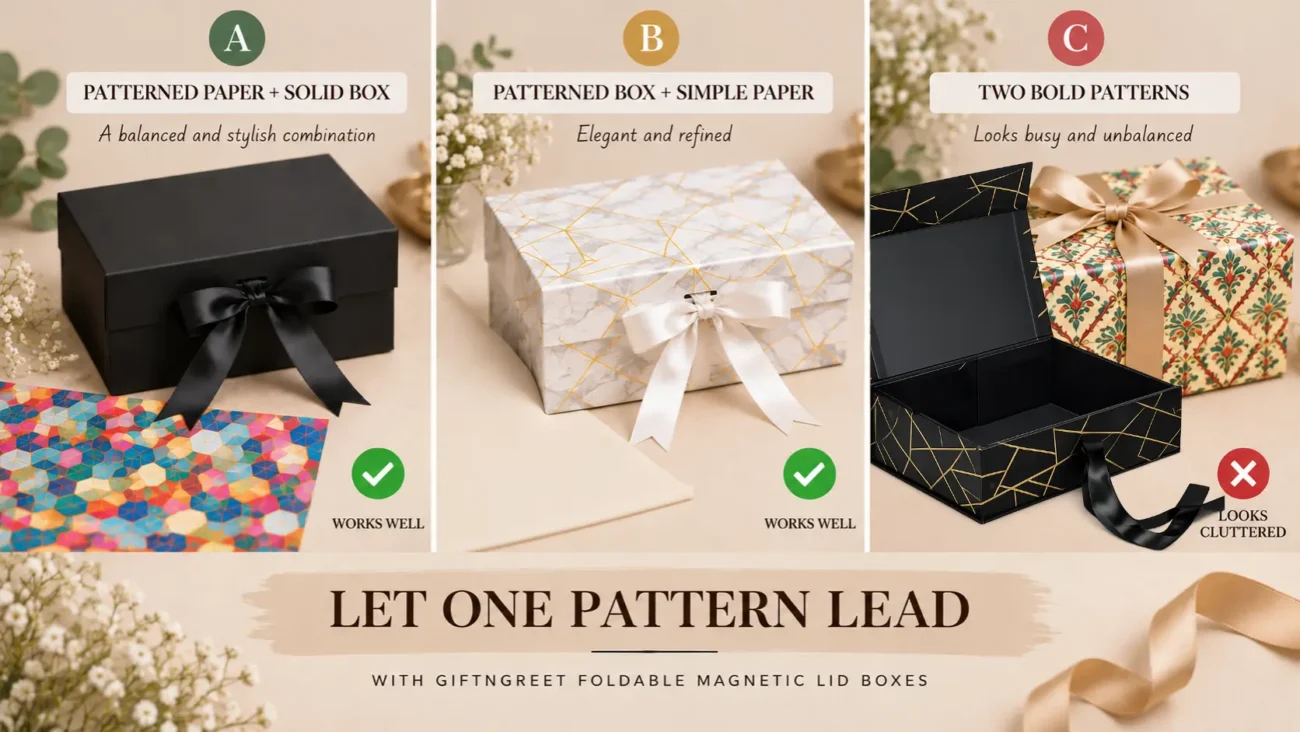
Let one pattern lead.
If the wrapping paper has a strong pattern, give the box a simpler visual treatment. If the box already has a noticeable pattern, keep the wrapping paper relatively quiet.
This doesn’t mean patterned packaging should always be paired with completely plain packaging. It simply means that one element should generally carry more of the visual detail than the other.
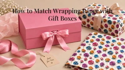
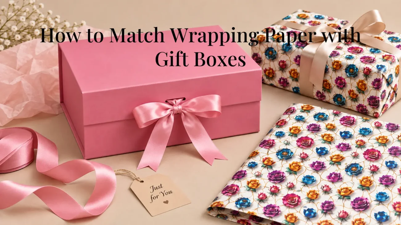
- Patterned Paper + Solid Box : This is one of the safest combinations. A floral, geometric, festive, or illustrated wrapping paper gets enough space to stand out when paired with a plain box.
This approach is particularly useful when the wrapping paper contains several colors. Instead of trying to find a box with another pattern that matches every detail, choose a solid shade that already appears in the paper. - Patterned Box + Simple Paper : The reverse works just as well. A box with a marble, textured, or decorative surface can be paired with:
— Plain paper
— Fine texture
— One-color paper
— Paper in a shade taken from the box
This keeps the packaging from becoming visually crowded. - Consider Pattern Scale : The size of the pattern matters too. A very large pattern can overwhelm a small box. At the same time, a tiny pattern may disappear when used across a large package.
As a general rule:
— Small box → smaller or simpler patterns
— Large box → larger patterns can work
— Strong box pattern → simpler wrapping paper
— Strong wrapping paper → simpler box - Can Two Patterns Work Together : Yes, but it requires more care. Two patterns can work when they share a color palette and have noticeably different scales. For example, a small repeated pattern can sometimes work with a larger, softer pattern on the box.
However, if you’re unsure, don’t force it. One strong pattern is usually easier to coordinate than two.
The same principle applies when adding ribbons, tags, or other finishing details. If both the box and wrapping paper are already visually detailed, keeping these smaller elements simple can prevent the overall package from becoming too busy.
How to Choose Wrapping Paper for a Specific Box
Once you understand the basic rules, how to choose wrapping paper for a particular box becomes much simpler. Instead of choosing paper based only on whether you like the design, consider how its color, pattern, finish, and scale will work with the actual box.
Before cutting the paper, run through this quick checklist.
- Look at the Box’s Dominant Color : Identify the color that stands out most. Your wrapping paper can:
— Match it closely
— Use a lighter or darker version
— Complement it
— Provide a controlled contrast
If the box contains several colors, you don’t necessarily need wrapping paper that includes all of them. Choosing just one quieter color from the box can often create a cleaner combination. - Check the Box’s Surface : Look at whether the box is:
— Plain
— Patterned
— Textured
— Matte
— Glossy
— Decorative
If the box already has a lot going on visually, simpler wrapping paper will usually work better.
The surface also matters when considering the overall balance. If the box has a noticeable finish, choosing wrapping paper with a less distracting surface can help keep the focus where you want it. - Consider the Box Size : Pattern scale should make sense for the size of the box. Don’t choose a very large, complicated print simply because you like it. Consider how that pattern will look once folded around the actual package. Important parts of a large design may end up hidden around corners or underneath folds.
As a general guide, simpler and smaller patterns are often easier to manage on smaller boxes, while larger packages can accommodate more noticeable patterns. - Think About the Occasion : The same box may need completely different wrapping depending on whether you’re preparing it for:
— A birthday
— A wedding
— Diwali
— Christmas
— Corporate gifting
— Everyday gifting
The occasion should influence the color and pattern before you make your final selection.
For example, playful prints may suit a birthday, while softer combinations may work well for wedding gifting. Festive occasions can accommodate stronger colors, whereas professional gifting may benefit from a more controlled palette. - Hold the Paper Against the Box : This is perhaps the easiest practical trick. Before cutting anything, hold the wrapping paper next to the box and look at them together. Check the combination from a short distance rather than judging the paper on its own.
If the combination looks too busy within a few seconds, it probably needs simplifying. You can also place the ribbon or tag next to the box at this stage. This gives you a better idea of how the complete package will look before you start wrapping.
Gift Box Wrapping Ideas Beyond Just Paper
Wrapping paper doesn’t have to do all the work. A few simple additions can round out the presentation and give you more room to coordinate the different elements.
The important thing is not to keep adding decorations. Instead, use each finishing detail for a purpose — to add a small accent, connect colors, or make the package easier to open and present.
- Ribbon and Wrapping Paper — Ribbon is one of the easiest ways to connect two different elements. Instead of choosing ribbon that exactly matches the wrapping paper, try taking a color from somewhere inside the paper’s pattern. For example, if your wrapping paper contains: cream + green + red, you could use a green ribbon rather than adding another new color. This creates a visual connection without making every element identical.
- Tissue Paper and Gift Boxes — Tissue paper and gift boxes work particularly well together when the box is opened and the inside becomes part of the presentation. A useful approach is to choose tissue paper that is:
- Slightly lighter than the box
- Slightly darker than the box
- Related to the wrapping paper
- A neutral shade that supports the overall palette
For a Foldable Magnetic Lid Box, tissue paper can be especially useful because the magnetic lid creates a natural opening moment where the inside of the box becomes visible. The tissue paper can therefore continue the color story from the outside to the inside.
- Tags and Small Details — A gift tag can provide the final connection between the different elements. Rather than introducing another color, choose a tag that picks up one of the existing colors. Box: white, Paper: blue and cream pattern, Ribbon: blue, Tag: cream. Everything has a relationship, but nothing is competing for attention.
The same principle can be applied to other small details. If the main packaging already contains several colors or patterns, keep additional elements simple.
If you want to explore more ways to use paper creatively in gifting and presentation, see our guide to creative ways to use wrapping paper beyond gifts. - Matching Wrapping Paper With Different Gift Box Types — The right approach also shifts slightly depending on the type of box you’re working with.
A box with a strong decorative surface may need simpler wrapping paper, while a plain box gives you more freedom to use a printed design. Thinking about the box first makes it easier to decide how much visual detail the wrapping paper should contribute. - Foldable Magnetic Lid Boxes — Because the lid lifts to reveal the inside, think about the wrapping paper (if wrapped) and the tissue paper together — they’ll both be visible at different points in the unboxing.
A simple exterior combination can therefore work particularly well with a coordinated interior. For example, a solid-color box paired with printed wrapping paper can be balanced by using tissue paper that picks up one of the quieter colors from the paper.
Common Mistakes People Make When Matching Paper and Boxes
Once you understand the basic principles, most mistakes become easy to spot.
The good news is that matching wrapping paper and gift boxes doesn’t require expensive materials or complicated styling. In many cases, the biggest improvement comes from removing one unnecessary element rather than adding another.
- Using Two Bold Patterns at Once : A strongly patterned box combined with strongly patterned paper can create too much visual competition.
Better approach: Let one pattern lead and keep the other element simple.
If you want to use two patterns, make sure they have a clear relationship through color or pattern scale. Otherwise, choose one main pattern and allow the other surface to provide visual breathing room. - Choosing Colors That Clash : Contrast can be intentional, but random color combinations can make the packaging look disconnected.
Better approach: Use a shared color, complementary colors, or shades from the same color family.
You don’t need every color to match. You simply need enough visual connection for the different elements to feel like they belong together. - Ignoring the Box’s Finish : A glossy box and highly reflective wrapping paper can compete for attention. Likewise, combining several highly textured surfaces can make the presentation feel visually heavy.
Better approach: Introduce some contrast between surfaces where possible.
If the box already has a noticeable finish or pattern, a simpler wrapping paper can provide balance. Similarly, a plain box gives you more freedom to experiment with the surface of the paper. - Skipping the Test Before Wrapping : Cutting the paper immediately is an easy mistake.
Better approach: Hold the paper beside the box first. It takes only a few seconds and can prevent wasted wrapping paper.
It takes only a few seconds and can prevent wasted wrapping paper. This quick test also lets you check whether the pattern scale, colors, and overall combination work before you commit to wrapping. - Adding Too Many Colors : A box, wrapping paper, ribbon, tag, tissue paper, and decorative elements can quickly introduce too many competing colors.
Better approach: Keep the main palette to approximately two or three colors.
If the wrapping paper already contains several colors, choose one or two of those colors for the ribbon, tissue paper, or tag instead of adding completely new shades. - Trying to Make Everything Match Exactly : This is another common mistake. If the box, paper, ribbon, tissue, and tag are all exactly the same shade, the presentation can lose contrast.
Better approach: Use related colors rather than identical ones.
A lighter shade, darker shade, or complementary accent can create enough variation while keeping the overall package coordinated.
A Few Final Thoughts
Matching wrapping paper with a gift box doesn’t need to become a complicated design exercise.
Start with the box. Look at its color, pattern, size, and finish. Then decide whether your wrapping paper should support it or become the main visual feature.
From there, keep the color palette controlled, avoid putting two strong patterns against each other, and use ribbon or tissue paper to connect the different elements.
If you’re working with a box that already has a noticeable appearance, such as a marble-pattern Foldable Magnetic Lid Box, simplicity is often the better choice. A plain wrapping paper, one coordinating ribbon, and a simple tag can be enough to create a balanced presentation.
And if you’re starting with a plain or solid-color box, that’s where you have more freedom to let the wrapping paper provide the visual interest.
The goal isn’t to make every element identical. It’s simply to make the box, paper, and finishing details feel like they belong together.
When in doubt, remember the simplest formula from this guide: choose one element to lead, keep the colors connected, and let the other elements support it.
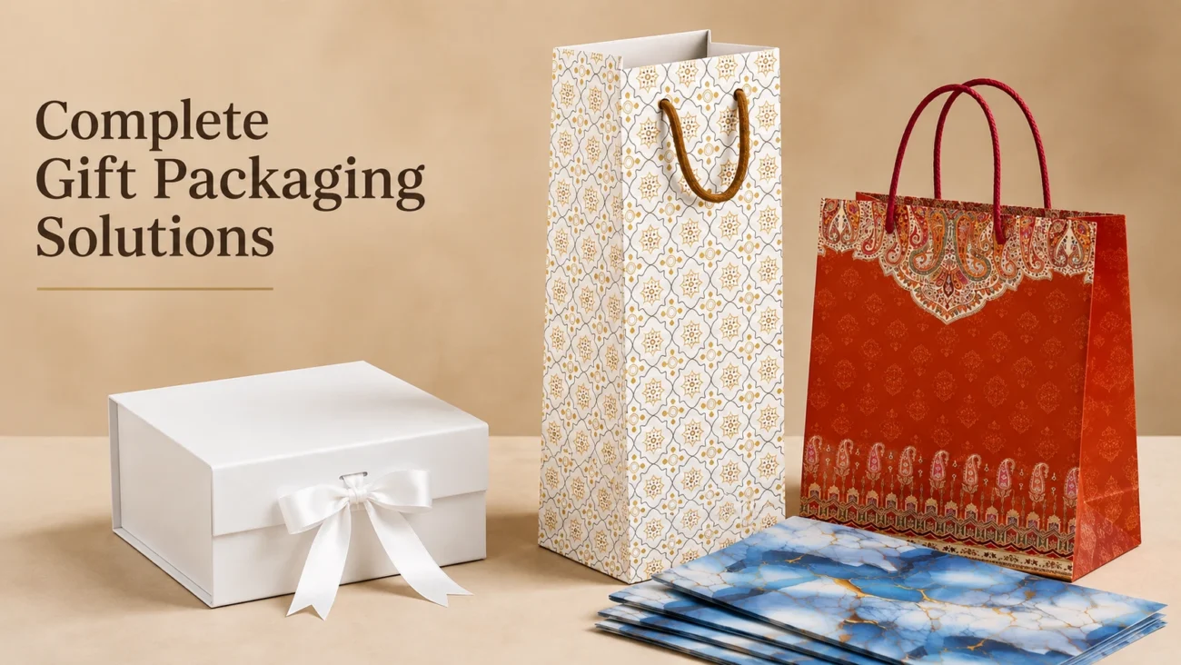
For businesses looking for ready-made gift packaging, selecting a suitable box or bag based on product size, presentation requirements, and intended use can help create a more consistent customer experience.
Explore:
Wrapping Paper Sheets for Gift Packaging
Ready-made Magnetic Lid Gift Boxes
Ready-made Paper Gift Bags for Retail and Gifting
To enquire about available products and bulk purchasing requirements, contact GiftNGreet.
Frequently Asked Questions
Start by deciding which element should stand out most. If the box is patterned, use simpler wrapping paper. If the wrapping paper has a strong print, pair it with a plain or solid-color box. Keep the overall palette to two or three colors.
Most solid-color boxes can work with related, complementary, or intentionally contrasting wrapping paper. A simple starting point is to choose paper from the same color family as the box and add one contrasting accent through the ribbon or gift tag.
Yes, but it is easier to get right when the patterns share a color palette and have noticeably different scales. If both patterns are equally bold and similar in scale, the result can look cluttered.
Yes. The box’s surface affects how the wrapping paper looks beside it. If both surfaces are highly reflective or visually busy, they may compete. Combining a more noticeable finish with a simpler surface can create better balance.
A solid-color gift box paired with printed wrapping paper is one of the easiest combinations. Let the paper provide the main pattern and use a ribbon in one of the colors found in that pattern.
Not necessarily. Tissue paper can be a lighter or darker shade of an existing color, or it can complement the box and wrapping paper without matching either one exactly.
Using the same wrapping paper across a coordinated set generally creates a stronger sense of unity. You can introduce small variations through ribbon or tags while keeping the main paper consistent.
Start with the occasion’s overall mood. Use playful colors and patterns for birthdays, softer palettes for weddings, stronger colors for festivals, and controlled neutral combinations for professional or corporate gifting.
Using too many strong visual elements at once is one of the most common mistakes. A bold box, busy wrapping paper, contrasting ribbon, and several additional colors can quickly become overwhelming. Choosing one main pattern and a controlled color palette usually produces a better result.
Related Reading
- Creative Ways to Use Wrapping Paper Beyond Gifts
- Different Types of Gift Boxes for Every Occasion
- How Gift Boxes Improve Product Presentation
- Why Packaging Matters: First Impressions in Gifting
Manufactured in New Delhi
Packaging Designed For Every Occasion
Explore GiftNGreet’s collection of gift boxes, paper gift bags, wrapping paper, and packaging solutions suitable for gifting, retail businesses, celebrations, and everyday presentation.
Looking for packaging solutions? Visit our Contact Us page for retail and bulk enquiries.