
Packaging Insights
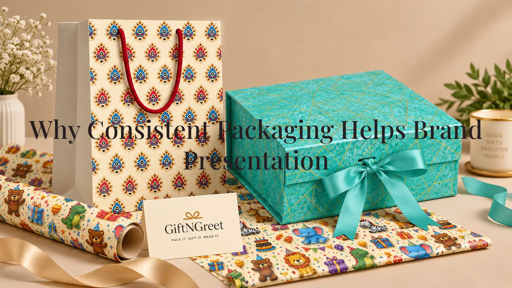
Here’s a small experiment: think of three brands whose packaging you’d recognize with the logo covered up. Chances are it’s not the logo doing all the work — it’s the color, the shape, the layout, and the way the Consistent Packaging looks like itself, no matter which product you’re holding. That’s packaging consistency, and it’s one of the most underrated tools a business can use to build a recognizable and reliable brand presence.
This isn’t about spending more money or changing everything at once. It’s about making sure that once you’ve established a packaging approach that works, you apply it consistently across your boxes, bags, and product lines.
When colors, packaging formats, visual elements, and presentation follow a clear pattern, customers have more opportunities to recognize the business over time. Here’s why that matters, and how to build packaging consistency without over-complicating it. Packaging is also an important part of how customers form a first impression of a brand through its presentation, particularly when the physical packaging is seen before the product itself.
The Short Version
- Consistency makes a brand easier to recognize without requiring customers to read the label
- It can build familiarity and confidence over repeated interactions
- Small inconsistencies, such as different shades or changing logo placement, can gradually weaken visual recognition
- You don’t need a large budget — you need a small set of clear packaging rules and the discipline to follow them
- Consistent packaging can also make a business appear more established and organized, including when the business is relatively new
- Packaging consistency doesn’t mean every box or bag has to look identical; the important visual elements should remain connected
The key is repetition with enough flexibility. Different products may require different packaging formats, but the overall visual language should still make them feel like they belong to the same business.
What “Consistent Packaging” Actually Means
Consistent packaging doesn’t mean every box or bag looks identical.
It means the key elements remain recognizable even when the specific product, size, or packaging format changes. This might include the same core colors, logo treatment, typography, or general visual style across the packaging a business uses.
Think of it less like a uniform and more like a signature. A signature isn’t written the exact same way every single time, but it remains recognizable.
That’s the standard worth aiming for with packaging: recognizable, not identical.
For example, a business may use paper bags for some products and boxes for others. The shapes and sizes can vary, but using a consistent color palette, logo treatment, and overall visual approach can help both formats feel connected.

Why Packaging and Brand Recognition Are So Closely Linked
Packaging and brand recognition are closely connected because packaging can be one of the most visible physical elements associated with a business.
A logo on a website may only be seen for a moment. Physical packaging, however, can remain visible on a table, inside a store, in a customer’s home, or while a product is being carried from one place to another.
Several factors contribute to this connection:
- Repetition builds recognition — the more consistently a color, shape, logo treatment, or packaging style appears, the more familiar it can become.
- Recognition can happen before reading — customers may notice packaging colors, shapes, or visual patterns before consciously reading the brand name.
- Consistency compounds over time — one package may create an impression, but repeated exposure to a consistent packaging style gives customers more opportunities to remember it.
This is one reason packaging consistency matters beyond appearance. Repeated visual elements can create a recognizable pattern that customers begin to associate with a particular business.
The more consistent the basic visual cues are, the easier it becomes for customers to connect different products or purchases with the same brand.
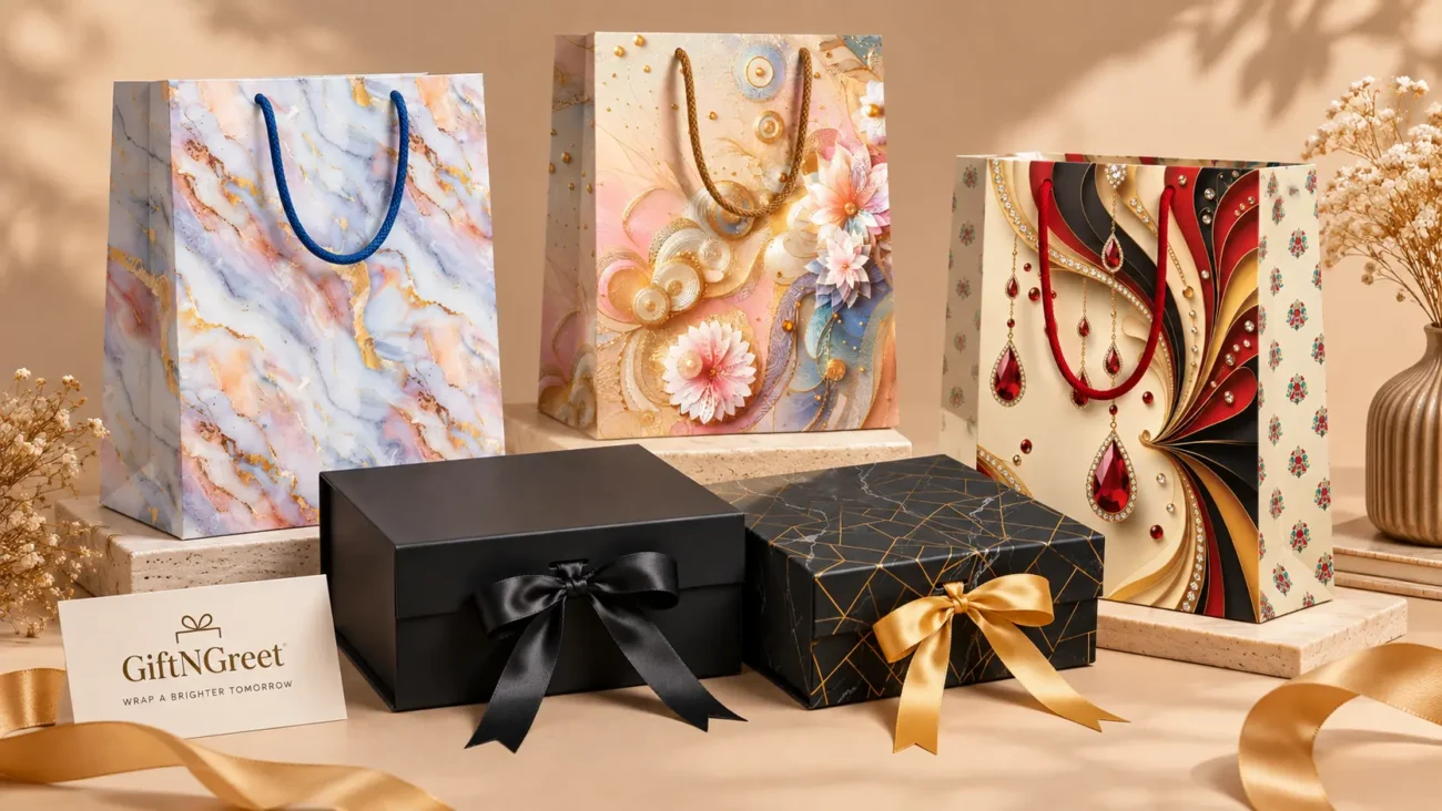
Consistent Packaging and Brand Recall: Why It Matters After the Purchase
Packaging and brand recall is slightly different from recognition.
Recognition is about identifying a brand when you see it. Recall is about remembering that brand later, when you are no longer looking directly at its packaging.
That distinction matters because customers may encounter a brand’s packaging and then think about it again when they are ready to purchase, recommend a business, or look for a product they have previously bought.
- Distinctive, consistent packaging can be easier to recall than packaging that changes significantly from one purchase to another.
- Recall can support repeat purchases when customers can remember the brand and connect it with a previous experience.
- Recall can also support referrals because recognizable packaging can give customers an additional way to describe a business to someone else.
If packaging changes constantly, each version has less opportunity to become associated with the same business.
Consistency gives customers something familiar to hold onto.
How Consistent Packaging Shapes Brand Presentation, Not Just Brand Looks
Packaging and brand presentation go beyondPackaging and brand presentation go beyond aesthetics. Consistency can communicate something about how a business approaches its products and customer experience.
- Consistency can signal professionalism. A business whose packaging looks different from one order to the next may appear less organized, even when the products themselves are consistent.
- Consistency can communicate reliability. When customers repeatedly see familiar packaging, it can reinforce a sense of familiarity and predictability.
- Inconsistency can create uncertainty. Customers may not consciously identify mismatched packaging, but frequent changes in colors, formats, or visual treatment can make the overall brand presence feel less connected.
This is why professional brand presentation often comes down to a simple question:
Does this packaging look like it came from the same business every time?
The answer doesn’t have to be yes because every package is identical. It should be yes because the important visual elements are clearly connected. This consistency also contributes to a more organized product presentation across different packaging formats, particularly when a business uses multiple types of bags and boxes.
Packaging and Brand Identity: Where Consistency Actually Starts
You can’t be consistent with something that was never defined in the first place.
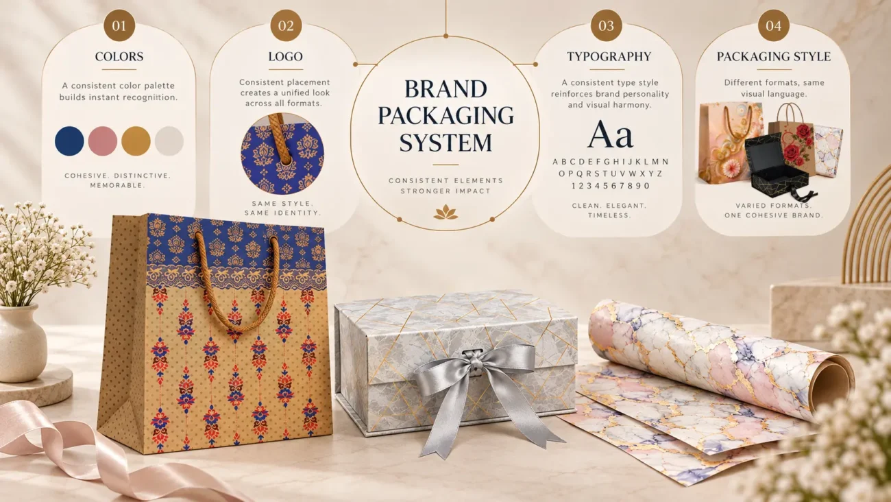
Brand identity — including the colors, typography, logo treatment, and general visual language a business uses — provides the foundation on which packaging consistency is built.
The goal isn’t to create a complicated rule-book. Even a small set of clearly defined visual decisions can make packaging easier to manage across different products and orders.
- Brand Colors : A small, fixed color palette — such as two or three core colors plus, where appropriate, one accent — is far easier to apply consistently than an open-ended approach where colors change from one packaging order to another. Once the main colors are established, they can be applied across different packaging formats while still allowing each product to have its own practical requirements.
- Logo Placement : Where a logo sits — corner, center, or another consistent position — matters less than whether the placement follows a clear rule. Predictable placement helps create familiarity across different packaging types. The same principle can apply to logo size and spacing.
- Typography : If a business uses text on its packaging, such as a tagline, website address, or other information, sticking to one or two consistent fonts can prevent different packaging batches from appearing visually unrelated. Typography should remain readable as well as consistent, particularly when packaging comes in different sizes.
- Packaging Aesthetics as a Whole : Beyond individual elements, the overall feel — clean and minimal, warm and textured, bold and colorful, for example — should remain recognizable even as specific packaging formats change. A paper carry bag and a gift box do not need to look exactly alike. They simply need enough shared visual elements for customers to understand that they belong to the same brand.
Consistent Packaging Design Across a Product Range
Consistency becomes more important when a business uses several types of packaging.
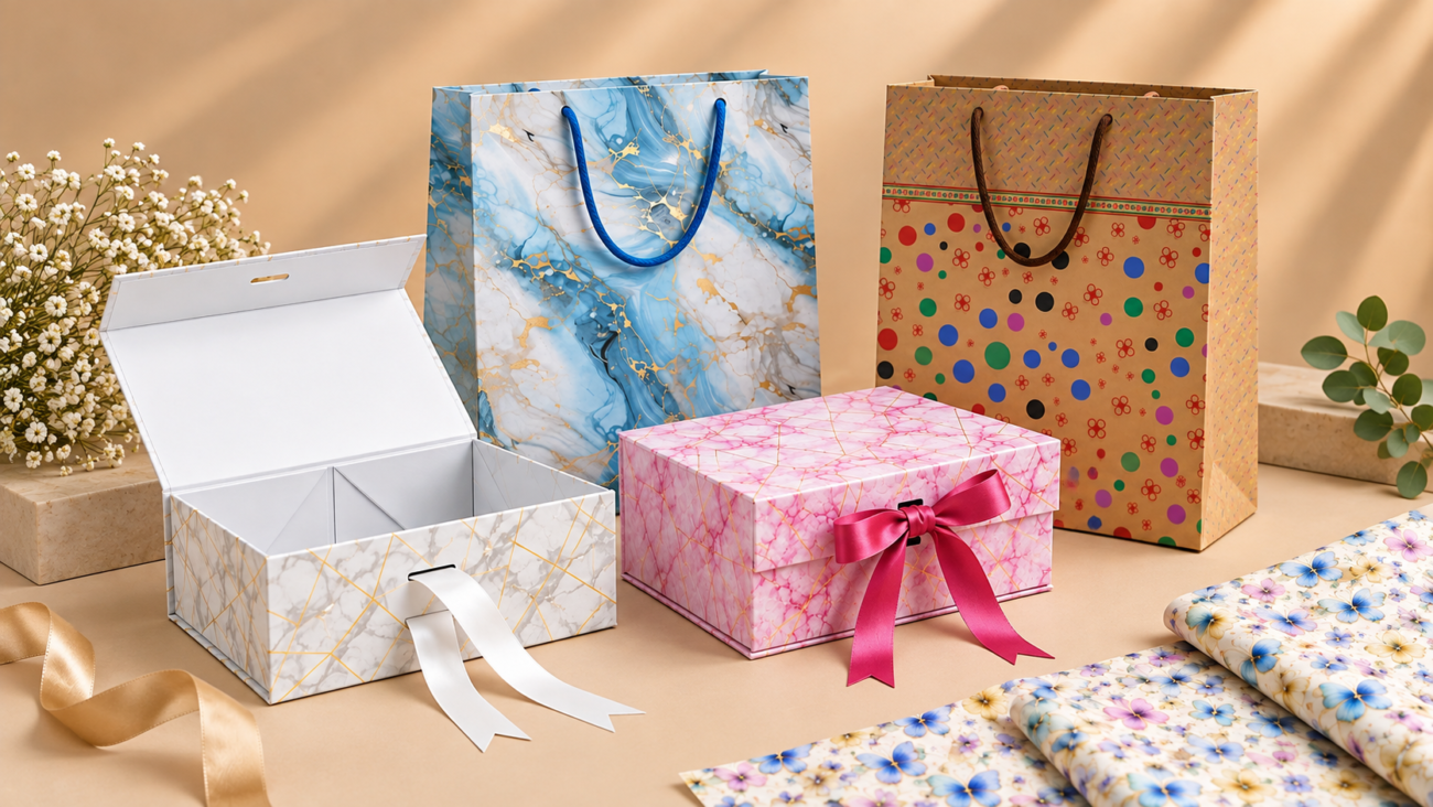
A retail store, gifting business, or product-based company may use paper bags, gift boxes, wrapping paper, and other packaging formats. These products do not need to look identical, but they should still feel like they belong to the same brand.
A useful approach is to establish a few visual elements that can appear across the packaging range. These might include:
- A consistent color palette
- Similar logo placement
- A defined typography style
- Repeated design elements or patterns
- Similar levels of visual simplicity
- Consistent proportions and spacing where practical
For example, a business might use a solid-color paper bag for everyday purchases and a gift box for selected products. The formats are different, but using related colors, logo treatment, and visual elements can create a more connected presentation.
This is particularly useful for businesses managing multiple packaging formats because customers can begin to associate those recurring elements with the brand. Businesses can also choose from different types of paper gift bags based on product, occasion, and presentation needs while keeping their overall packaging approach consistent.
Consistent Packaging Presentation and the Customer Experience
Consistent product presentation shapes more than first impressions — it shapes the entire relationship a customer has with a brand over multiple purchases.
Packaging is part of the customer experience, even when the customer does not consciously think about it.
Imagine buying from the same business several times. If the packaging looks organized and follows a familiar visual approach each time, the experience can feel more predictable. Customers know what to expect, and that familiarity can contribute to a stronger connection with the business.
Inconsistent packaging can have the opposite effect. If the colors, logo treatment, packaging quality, or overall appearance change dramatically from one purchase to another, the brand may become less recognizable.
Consistency does not mean removing variety. A business can still use different packaging for different products, occasions, or order sizes. The important part is making sure those choices still follow a recognizable overall approach.
This is especially relevant for retailers and gifting businesses where the packaging may be seen by the customer, recipient, and sometimes even other potential customers after the purchase. For a broader look at how packaging affects interactions beyond the physical product, see our guide to how packaging influences the customer experience.
Packaging Consistency and Perceived Value
Packaging does not determine the actual value of a product, but it can influence how organized, reliable, and carefully presented a business appears.
When packaging is consistent, customers may perceive greater attention to detail. A product presented in packaging that follows the same visual standards as previous purchases can reinforce the impression that the business has a clear and organized approach.
This is one reason packaging consistency matters even for businesses that are not trying to create elaborate packaging. Simple packaging can work effectively when it is applied thoughtfully and consistently.
For example, a business using solid-color paper bags across different product categories can create a recognizable visual system without making every bag look exactly the same. The consistency comes from the repeated use of selected colors, logo treatment, and presentation choices.
The goal is not to make packaging look more expensive. The goal is to make the packaging look intentional, dependable, and connected to the business behind it.

How to Build Packaging Design Consistency Without Over-Complicating It
Creating packaging consistency does not require a complicated design manual. For most businesses, a few clear rules can make the process much easier.
- Start With Your Core Visual Elements — Identify the elements that should remain consistent across packaging:
- Primary brand colors
- Logo treatment
- Typography
- General visual style
- Key spacing and layout preferences
These become the foundation for different packaging formats.
- Decide What Can Change — Not every packaging element needs to remain fixed. A paper bag may have a different layout from a gift box because the physical formats are different. Seasonal packaging may also introduce another color or design element.
The important question is: Does the packaging still feel connected to the same brand? Allowing controlled variation prevents consistency from becoming repetition. - Create Simple Packaging Guidelines — A basic internal guide can specify:
- Which colors should be used
- Where the logo normally appears
- Which fonts are preferred
- How much visual information should appear on packaging
- Which design elements should be repeated
- Which elements can change between packaging formats
This makes decisions easier when new packaging is introduced.
- Choose Packaging Formats That Work Together — When selecting bags, boxes, and other packaging, consider how they will look when used together.
For example, if a business uses a particular color family for its paper bags, selecting gift boxes and wrapping materials that work within the same visual direction can create a more cohesive presentation. - Review the Full Packaging Range Together — One packaging item may look perfectly consistent on its own but feel disconnected when placed beside the rest of the range.
Every so often, review the packaging together rather than individually. Ask:- Do the colors work together?
- Is the logo treatment consistent?
- Does the packaging look like it comes from the same business?
- Are some designs noticeably more complicated than others?
- Is there a clear visual pattern across the range?
This simple review can reveal inconsistencies before they become part of the regular packaging system.
A Practical Example: Solid Color Paper Bags as a Consistency Tool
Solid color paper bags are a simple example of how consistency can be built across everyday packaging.
Instead of relying on a different design for every product or occasion, a business can use a consistent color approach across its paper bags. The logo and other brand elements can then provide the recognizable connection between different purchases.
For example, a retailer might use one core bag color for everyday purchases and another color from the same visual palette for specific product categories or occasions. The bags can still serve different purposes while maintaining a connected appearance.
This approach can be particularly useful when packaging needs to work across a range of products. The consistency comes from the repeated visual system, rather than making every individual package identical.
When selecting paper bags, businesses should also consider size, construction, handle type, and how the bags will be used. Visual consistency works best when the packaging is also practical for the products being carried. For more guidance on selecting paper bags for different applications, explore our guide to different types of paper gift bags and their uses.
- Common Mistakes That Quietly Undermine Packaging Consistency : Even businesses that understand the importance of consistency can introduce small differences that gradually weaken their overall presentation.
- Changing Colors Too Frequently : Using completely different colors for every packaging format can make the brand harder to recognize. Variation is fine, but new colors should still have a logical connection to the established visual palette.
- Moving the Logo Around : A logo that appears in a different position, size, or proportion on every package can reduce visual consistency. Where possible, establish a standard approach for logo placement and spacing.
- Making Every Package Look Completely Different : Different packaging formats naturally require different layouts. However, giving every bag, box, or wrapping material an unrelated visual style can make the overall range feel disconnected.
- Using Too Many Design Elements : Adding multiple fonts, colors, patterns, graphics, and decorative elements can make packaging difficult to recognize as part of one system. A simpler visual approach is often easier to maintain.
- Ignoring Physical Differences Between Packaging Formats : Consistency does not mean forcing the exact same layout onto every packaging format. A paper bag, gift box, and wrapping paper have different dimensions and functions. Their designs should adapt to those physical differences while retaining key brand elements.
- Focusing Only on Appearance : Packaging consistency is not purely visual. If one packaging format is significantly less practical, less durable, or poorly suited to the product compared with the rest of the range, the customer experience can become inconsistent even when the colors and logo match. A better approach is to consider appearance, functionality, size, construction, and intended use together.

The Bottom Line
Consistent packaging helps make a brand easier to recognize, easier to remember, and more organized in the eyes of customers.
It does not require every package to look identical. Instead, businesses can establish a few recognizable elements—such as colors, logo treatment, typography, and overall visual direction—and apply them consistently across different packaging formats.
The most effective approach is usually straightforward: define what should stay consistent, decide where variation is acceptable, and review the complete packaging range regularly.
Whether a business uses paper bags, gift boxes, wrapping paper, or several formats together, consistency can turn individual packaging choices into a more connected overall brand presentation.
Explore GiftNGreet Packaging
Frequently Asked Questions
Yes. Repeated use of recognizable colors, logos, typography, and visual elements can make packaging easier for customers to associate with a particular business.
No. Different packaging formats can have different layouts and designs. The important elements are the visual connections that make the packaging feel like part of the same brand.
Consistent packaging can support brand recognition, create a more organized presentation, and provide customers with a more predictable experience across different purchases.
Yes. Consistency depends more on how packaging elements are selected and repeated than on how complicated the packaging design is.
Small businesses can start with a limited color palette, consistent logo placement, defined typography, and a few simple packaging guidelines. These rules can then be applied across different packaging formats.
Inconsistent packaging can weaken recognition and make a business appear less organized. While packaging is only one part of customer trust, maintaining a consistent presentation can support a more reliable overall experience.
There is no fixed number. The right formats depend on the products, order sizes, occasions, and practical requirements of the business. The key is ensuring that the selected formats work together visually and functionally.
Related Reading
- How Packaging Influences Customer Experience
- How Retail Stores Benefit from Organized Gift Packaging
- Types of Paper Gift Bags Explained
- Packaging Ideas for Corporate Gifting
Manufactured in New Delhi
Packaging Designed For Every Occasion
Explore GiftNGreet’s collection of gift boxes, paper gift bags, wrapping paper, and packaging solutions suitable for gifting, retail businesses, celebrations, and everyday presentation.
Looking for packaging solutions? Visit our Contact Us page for retail and bulk enquiries.